



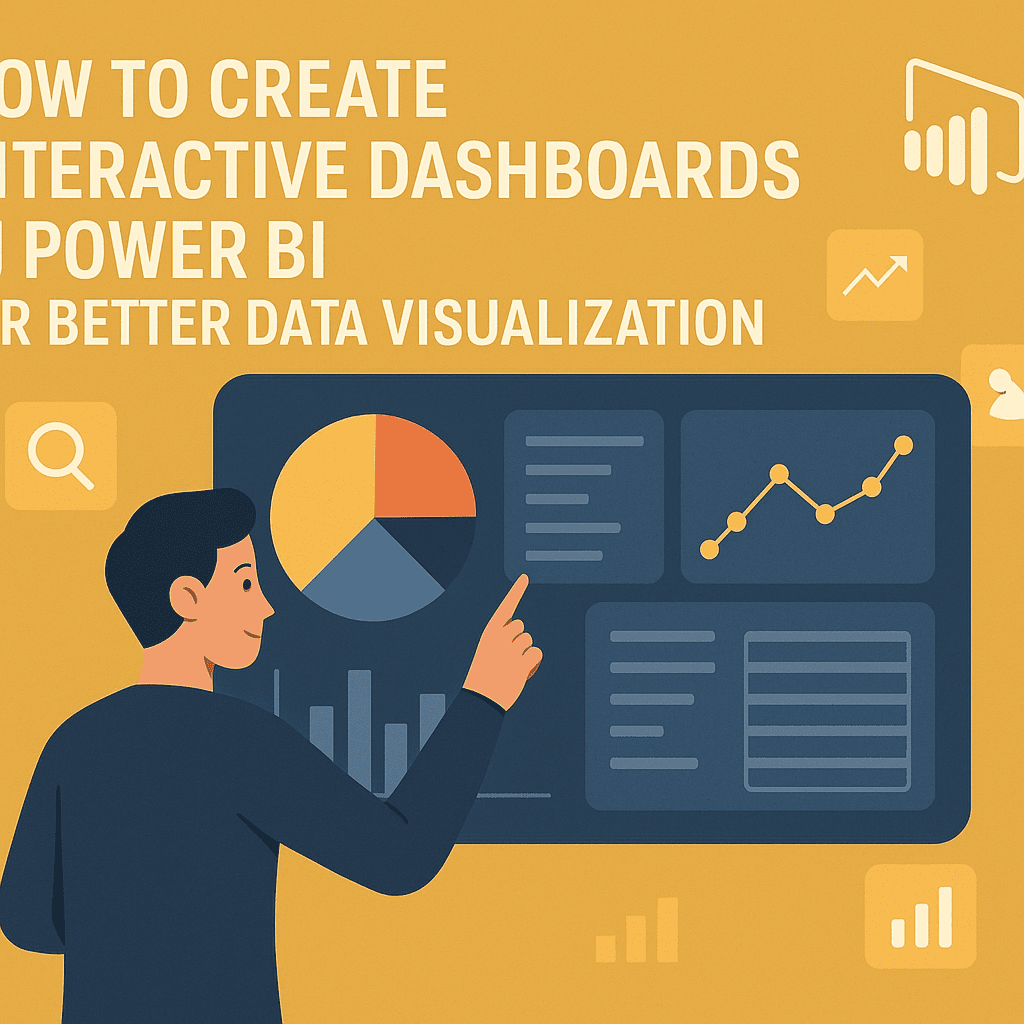
Creating interactive dashboards in Power BI can greatly enhance how you visualize and interact with your data. Whether you’re a beginner or have some experience, this guide will walk you through the steps to design dashboards that are not only functional but also visually engaging.
Choosing Your Data Source
Start by identifying your data source. Power BI supports a wide range of sources such as Excel, SQL databases, and online services like Google Analytics or Azure.
For example, let’s say you run an online retail store and want to analyze sales data. You could pull data from your SQL database that tracks daily sales, customer interactions, and inventory levels.
To connect your data source in Power BI:
- Open Power BI Desktop.
- Click on Get Data.
- Choose your data source type (e.g., SQL Server).
- Enter the database server details and choose your database.
Once you’re connected, select the necessary tables and load them into Power BI.
Data Transformation
After loading your data, the next step is data transformation. This involves cleaning and arranging your data for easier analysis. Power BI provides a Query Editor feature for this purpose.
Breakdown your data using the Query Editor:
- Remove unnecessary columns
- Rename columns for clarity
- Filter rows to exclude irrelevant data
Let’s say your sales data includes a ‘Discount’ field that you want to convert into a percentage. In Power BI, you can create a new column by using the formula:
plaintext
Discount Percentage = [Discount] / [Original Price]
Designing Your Dashboard
Once your data is ready, you can start designing the dashboard. Here’s how to create an interactive dashboard step-by-step.
-
Choose Visualizations: Power BI offers a variety of visualizations like bar charts, line graphs, maps, and more. For your retail dashboard, consider using:
- Bar chart for sales by product category.
- Line graph to show sales trends over time.
- Map to visualize geographical sales distribution.
-
Drag and Drop Visuals: Simply drag your chosen visualization from the Visualizations pane to the report canvas.
-
Add Slicers: Slicers allow users to filter the data interactively. For example, add slicers for date range and product categories. This will help stakeholders focus on specific periods or product types without cluttering the dashboard.
-
Format Your Visuals: Use the Formatting pane to enhance the look of your visuals. Select colors that align with your brand, and ensure your text is readable.
Here’s an example of how your dashboard might look:
| Product Category | Sales | Discount | Profit |
|---|---|---|---|
| Electronics | $5000 | 10% | $4000 |
| Clothing | $3000 | 15% | $2000 |
| Home Appliances | $4000 | 5% | $3500 |
Case Study: Online Retail Store Dashboard
Let’s consider a practical example for an online retail store. The dashboard you’re creating should help the management team track sales, inventory levels, and customer interactions.
Step 1: Data Import
You import data from three sources: sales transactions, inventory status, and customer feedback.
Step 2: Data Preparation
Using Power BI’s features, you aggregate monthly sales and filter customer feedback to analyze satisfaction.
Step 3: Build Visuals
- Sales Overview: Create a line chart to show sales over the last twelve months.
- Top Products: Use a bar chart to display the top 10 selling products.
- Customer Feedback: Implement a word cloud to visualize customer sentiments from reviews.
Once you have completed your visuals, your dashboard provides an overview of business performance.
Sharing and Collaboration
After creating your dashboard, the ultimate goal is sharing your insights. Publish your dashboard to the Power BI service:
- Click Publish in Power BI Desktop.
- Sign into your Power BI account.
- Choose your workspace and confirm.
This makes your dashboard accessible to other team members. They can view and interact with the dashboard directly in their browsers.
For wider collaboration, consider using Power BI embedded capabilities. This allows you to integrate your dashboards into web applications, providing stakeholders easy access without needing a Power BI account.
Mobile View
Power BI dashboards are designed to be mobile-friendly. To optimize your dashboard for mobile devices:
- Open your report in Power BI Service.
- Click on View and select Mobile View.
- Rearrange visuals to suit smaller screens.
This ensures that your stakeholders can access crucial insights anytime, anywhere 📱.
Best Practices for Dashboard Design
When designing dashboards, it’s beneficial to follow best practices to enhance usability and clarity:
- Limit Visuals: Too many visuals can be overwhelming. Aim for a maximum of 6-8 key visuals.
- Use White Space: Space around visuals helps to separate them and makes the dashboard easier to read.
- Highlight Key Metrics: Use cards or KPIs for displaying important values like total sales or customer satisfaction scores prominently.
Conclusion
With Power BI, creating interactive dashboards is a powerful way to visualize data and derive actionable insights. Following the steps and principles outlined above will ensure that your dashboards are not only effective but also engaging. Experiment with different visualizations and interactivity features to find what works best for your data storytelling.
FAQs
1. Can I use Power BI with Excel?
Absolutely! Power BI integrates seamlessly with Excel, letting you import tables and ranges directly from your spreadsheets.
2. Is Power BI free to use?
Power BI has a free version with basic features. For advanced capabilities, consider the Power BI Pro or Premium versions.
3. How do I update data in Power BI?
You can refresh your datasets in Power BI by clicking the refresh button, or set up scheduled refreshes through the Power BI service.
4. How can I create custom visuals in Power BI?
Power BI allows you to use custom visuals from the marketplace or even create your own using the Power BI Custom Visuals SDK.
For more resources, visit Power BI Services for services and templates. Happy visualizing! 🚀