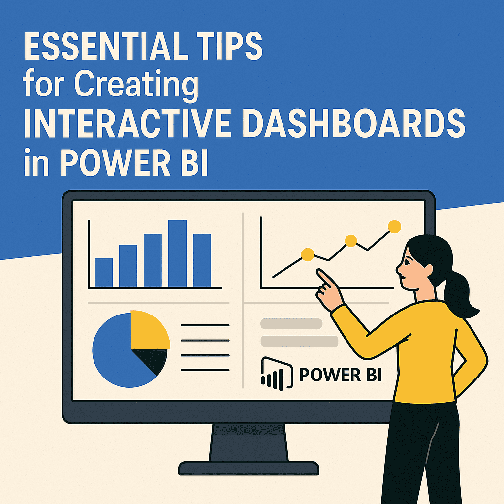




Transforming Data into Insights with Power BI
To truly harness the power of your data, it’s essential to turn raw numbers into meaningful insights. This tutorial will guide you through the processes and techniques that can effectively transform your data using Power BI.
Understanding the Basics
Power BI is a powerful business analytics tool that enables you to visualize your data and share insights across your organization. It allows users to create reports and dashboards that provide insights in a very interactive way. The first step to transforming data into insights starts with understanding how to connect Power BI to your data sources.
Step 1: Connect to Your Data Sources
Power BI allows you to connect to various data sources, whether it’s Excel spreadsheets, SQL databases, or cloud services. Here’s how to do it:
- Open Power BI and select Get Data.
- Choose your data source (e.g., Excel, SQL Server, Web).
- Authenticate if required and click Connect.
Example: Connecting to an Excel file
Suppose you have a sales report in Excel. You can connect to it by:
- Choosing Excel from the Get Data menu.
- Selecting the file and loading the necessary tables into Power BI.
Step 2: Clean and Transform the Data
Once connected, it’s essential to clean and transform your data for better analysis. The built-in Power Query Editor allows you to shape your data without any coding.
- Remove Duplicates: Click on the column header, navigate to the Transform tab, and click Remove Duplicates.
- Change Data Types: Ensure that your numbers are formatted correctly by right-clicking the column header and choosing Change Type.
| Step | Description |
|---|---|
| Remove Duplicates | Cleans up duplicate entries |
| Change Data Types | Ensures data accuracy |
| Rename Columns | Clear labeling for easier understanding |
Small Case Study: Improving Sales Analysis
Let’s say your sales data has several duplicate entries. By removing these duplicates and ensuring that your sales figures are in the correct format, your insights become much clearer. After cleaning, you realize that your best-performing product is the “Eco-Friendly Bottle.” 📊
Visualization Techniques
Step 3: Create Visualizations
Creating effective visualizations is where the magic happens. Power BI offers a variety of charts, maps, and graphs. Here’s how to make your data visually appealing:
- Choose a Visualization Type: Select from line charts, bar charts, maps, etc.
- Drag and Drop Fields: Move your fields into the visualization pane. For instance, dragging “Revenue” to the values and “Month” to the axis in a line chart displays revenue trends over time.
Example: Visualizing Sales Growth
To illustrate your sales growth over the past few months:
- Insert a line chart.
- Use “Sales Amount” for values and “Month” for the axis.
By doing this, you offer a clear perspective on sales trends, making it easier to make strategic decisions.
Building Interactive Dashboards
Step 4: Creating Dashboards
An appealing dashboard combines various visualizations to present a comprehensive picture of your data. In Power BI, you can pin visuals from various reports to create a dashboard.
- Select the visual you want to pin and click on the pin icon.
- Choose which dashboard to pin it to or create a new one.
Interactivity: Users can interact with the dashboard—clicking a bar on your sales chart could filter all related visuals to show information only about that product.
Sharing Insights
Step 5: Share Your Insights
Once your dashboard is ready, it’s time to share your insights with stakeholders.
- Go to your dashboard.
- Click the Share button.
- Enter the email addresses of your colleagues.
Power BI makes sharing easy, ensuring everyone has access to the latest insights.
Power BI Dashboard Services and Tools
If you’re looking to enhance your experience with Power BI, consider exploring different dashboard services and tools. Here are some recommended resources:
Utilizing Advanced Features
Step 6: Using DAX for Calculations
Data Analysis Expressions (DAX) can elevate your reporting capabilities beyond simple aggregations.
- Use DAX to create new measures (e.g., calculating the year-over-year growth).
- Example Measure:
YoY Growth = (SUM(Sales[Current Year]) - SUM(Sales[Last Year])) / SUM(Sales[Last Year])
- Example Measure:
By implementing DAX measures, you’ll be able to perform complex calculations seamlessly, adding depth to your reports.
Examples to Enhance Understanding
Imagine your company’s sales data from the last quarter:
- Total Sales: $100,000
- Sales Last Year: $80,000
Applying the DAX measure:
- YoY Growth:
= ($100,000 – $80,000) / $80,000 = 0.25 or 25% growth
This analysis reveals how well your business is performing compared to the previous year.
Conclusion
Transitioning from raw data to insightful reports is a journey worth taking. By following the steps outlined above and utilizing Power BI’s incredible features, you will undoubtedly transform your data into actionable insights. Remember to engage with the various tools available at your disposal to maximize your Power BI experience.
FAQs
1. What is Power BI?
Power BI is a business analytics tool from Microsoft that turns data into interactive visualizations.
2. Can I connect to cloud data sources?
Yes, Power BI supports connections to various cloud services, including Azure, Google Analytics, and more.
3. How do I share my Power BI dashboard?
Simply click the “Share” button on your dashboard and enter the email addresses of your colleagues.
4. Is there a way to automate data refresh in Power BI?
Yes, you can schedule data refreshes in Power BI to ensure your reports are always up to date.
5. What is DAX?
DAX (Data Analysis Expressions) is a formula language used in Power BI for defining custom calculations in your reports.
By following the guidance in this tutorial, you will be well on your way to extracting valuable insights from your data using Power BI. Happy analyzing! ⚡