


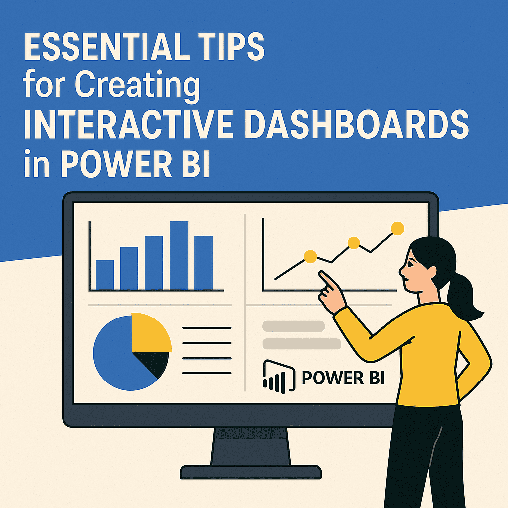
Essential Tips for Creating Interactive Dashboards in Power BI
When diving into Power BI, creating interactive dashboards can be extraordinarily rewarding, yet it can also seem daunting initially. With a mix of creativity and technical know-how, your dashboards can go from plain data displays to engaging visual stories. Let’s explore the ins and outs of crafting captivating dashboards, focusing on user interaction and data visualization.
Understand Your Audience 🤔
Before starting the design process, it’s crucial to know who will be using your dashboard. Are they executives needing high-level insights, or analysts diving deep into the data? Create a wireframe to visualize how these different users will interact with the data.
Example: If you are designing for a sales team, prioritize sales performance metrics like total sales, sales by region, and top-selling products.
Use Clear Visualizations 📊
Visual elements are fundamental to making your dashboard interactive. Opt for charts and visuals that clearly communicate the data without overwhelming the user.
Consider using:
- Bar Charts for comparisons
- Line Charts for trends over time
- Pie Charts for part-to-whole relationships
Interactivity: Filter and Drill Down 🔍
One of the standout features of Power BI is its ability to create interactive elements. Use slicers and filters to allow users to customize their views. For instance, adding a slicer for date ranges enables users to examine specific periods without cluttering the main visuals.
A Case Study: Sales Performance Dashboard 🏆
Let’s consider a practical example with a fictional retail company, “Retail Dynamics.” They need a dashboard focused on sales performance.
Imagine this layout:
| Metric | Visualization |
|---|---|
| Total Sales | Card |
| Sales by Region | Stacked Column Chart |
| Top-selling Products | Table |
| Sales Trend | Line Chart |
By clicking on a specific region in the stacked column chart, users can filter all other visuals declaratively to reflect data for that region.
Optimize Layout and Design 🎨
A clean, uncluttered design enhances usability.
- Align visuals evenly.
- Maintain consistent color schemes; consider using color to convey meaning (e.g., red for decreasing sales).
- Provide sufficient spacing between visuals to avoid a crowded look.
Leverage Tooltips for More Insights 🛠️
Tooltips can provide additional context without cluttering your dashboard. For instance, hovering over a sales number in a card can reveal details like average sales per representative or year-over-year growth.
Utilize Power BI Features 📈
Power BI offers several out-of-the-box features that enhance interactivity:
- Bookmarks allow users to capture the current state of a report page.
- Drillthrough enables users to right-click on data points and navigate to a detailed page focusing on that specific data.
Using these features effectively can elevate user experience significantly.
Test with Real Users 👥
Before rolling out your dashboard, it’s essential to test it with actual users. Gather feedback on usability, interactivity, and whether the visuals convey the intended message. Make adjustments based on this feedback.
For instance, if users find certain visuals unclear, consider redesigning those elements or simplifying the information.
Stay Updated with Power BI Services 🔄
Power BI continuously evolves, offering new features and enhancements. Keep abreast of product updates and best practices to ensure your dashboards remain effective and relevant. Utilizing links directly from the Power BI Dashboard Services can keep you informed.
Incorporate Power BI Templates 🛠️
Starting with a template can give you a sturdy foundation. Power BI offers various templates that allow you to visualize data immediately without starting from scratch. Consider browsing through available Power BI Templates for inspiration.
Plan for Scalability 📈
As organizations grow, their data needs evolve. It’s essential to structure your dashboard for scalability. Use measures and calculations wisely so that they remain efficient as more data gets added. Design dashboards that can adapt as new metrics and dimensions are required without extensive redesign.
Applying Data Storytelling 📖
Beyond raw numbers, weave a narrative throughout your dashboard. Use visual cues and text elements to guide users through the data. For instance, highlight significant wins or warning signs with what is called “callouts” or “annotations” in Power BI. Engaging storytelling will lead users to insights rather than just overwhelming them with numbers.
FAQs
Q: Can I share my dashboard with other users?
A: Absolutely! Using Power BI Service, you can easily share dashboards with other users by publishing them. Users need appropriate permissions to access shared content.
Q: Are there any limitations to Power BI dashboards?
A: Power BI dashboards have certain limitations, like a maximum of 10,000 rows in an import dataset, which can affect how visuals are rendered.
Q: What if I need support?
A: Visit the Power BI Support page for troubleshooting and assistance.
Q: How secure is my data in Power BI?
A: Power BI offers robust security features, including row-level security, ensuring that users only see data pertinent to them.
Q: Can I connect Power BI to other data sources?
A: Yes! Power BI supports numerous data sources, from Excel and SQL databases to cloud-based services and APIs.
Creating an interactive dashboard in Power BI can transform how data is consumed and analyzed within an organization. By focusing on user needs, employing powerful visualizations, and utilizing the platform’s features, you can craft dashboards that not only inform but also engage and inspire. Happy dashboarding! 🎉