


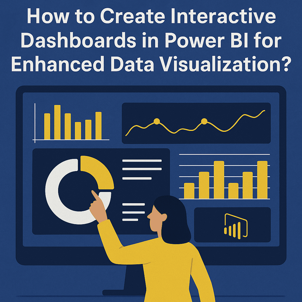
Creating Interactive Dashboards in Power BI for Enhanced Data Visualization
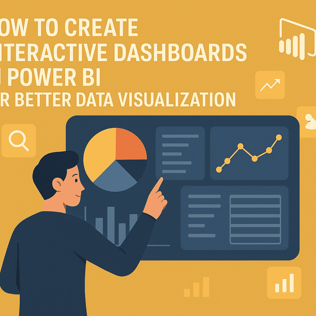
To create impactful and interactive dashboards in Power BI, you need to focus on a series of strategic steps that will ensure your data is not only visually appealing but also functional and user-friendly. Let’s dig into the process.
Understand Your Audience and Requirements
Before jumping into Power BI, knowing who your audience is crucial. Are they business executives, analysts, or operational staff? This understanding will guide you in choosing the right visuals, data granularity, and layout for your dashboard.
Example: A dashboard for an executive might highlight high-level KPIs, while a dashboard for analysts could drill down into data details.
Data Preparation
Your data must be clean and well-structured before visualization. Use Power Query in Power BI to:
- Remove duplicate entries
- Handle missing values
- Transform data types
Here’s a simple table showcasing transformations:
| Original Value | Cleaned Value |
|---|---|
| NULL | 0 |
| 45.56% | 0.4556 |
| “N/A” | NA |
Once your data is ready, ensure it’s linked correctly in the model.
Build a Data Model
Creating relationships between different data sets enhances the interactivity of your dashboard. Use Power BI’s relationship view to link tables based on key fields, ensuring that your analyses are cohesive.
Case Study: A retail company combines sales data with customer demographics. By creating relationships between these datasets, the marketing team can easily filter and visualize sales metrics alongside age or location information, gaining deeper insights into customer behaviors.
Selecting Visualizations
Choosing the right visuals is essential. Power BI provides a variety of options:
- Bar Charts: Great for comparing quantities across categories.
- Line Graphs: Useful for showing trends over time.
- Pie Charts: Good for showing proportional data.
- Map Visuals: Perfect for geographical data, like sales by region.
Let’s say you want to visualize sales growth over the last quarter. A line graph could illustrate this neatly. With Power BI, you can customize colors and labels to enhance clarity.
Enhance Interactivity
One of the standout features of Power BI is its interactivity. Here are some methods to enhance it:
- Slicers: Use slicers to allow users to filter data by specific categories (like time frames, product types, etc.) dynamically.
- Tooltips: Create custom tooltips that hold additional information about a data point when hovered over. This way, users can explore more without cluttering the dashboard.
- Drill-Down Features: Enable drill-down capabilities for charts so users can click through to see more detailed data.
Here’s an example where slicers and drill-down features can be combined:
| Slicer | Associated Visual |
|---|---|
| Product Category | Bar chart of Sales by Region |
| Time Period | Line graph of Monthly Trends |
Use Themes for Aesthetic Appeal
Aesthetic choice matters too. Power BI allows users to apply themes, which can significantly improve interest and engagement. You can customize fonts, colors, and the overall layout to align with your company’s branding.
Consider this theme application for a retail company:
- Colors: Use a warm palette that reflects the brand.
- Fonts: Select easy-to-read fonts, enhancing both style and readability.
- Layout: Arrange visuals in sections that follow a logical flow.
Deploy and Share
Once your dashboard is finalized, it’s time to deploy. Power BI offers various methods to share dashboards, such as:
- Publish to Web: Share via a public link. Be mindful of data privacy.
- Power BI Service: Share within your organization; this method maintains data security.
- Embed in Reports: Integrate your dashboard into company reports or emails.
Example of Sharing: If you publish a sales analysis dashboard, ensure notifications go out to your sales team so they know insights are now readily available.
Monitoring and Iteration
Creating a dashboard is not a one-time task. Continuous monitoring is crucial. Collect feedback from users and make adjustments as necessary. For instance, if users are frequently filtering data by a new category, consider adding it as a default filter.
Learning Resources
If you want to dive deeper into creating dashboards, consider exploring these resources:
FAQs
1. What types of interactive elements can I include in my Power BI dashboards?
You can include slicers, drill-throughs, bookmarks, and tooltips among other elements for interactivity.
2. How do I publish my dashboard after creating it?
You can publish your dashboard directly from Power BI Desktop using the “Publish” button. Choose the workspace where you want it to go.
3. Can I customize visuals in Power BI?
Absolutely! Power BI allows you to customize colors, sizes, and labels to fit your needs.
4. How frequently should I update my dashboard?
The update frequency depends on your data’s volatility. A daily update may be necessary for fast-moving industries, whereas monthly updates could suffice for others.
5. Are there limitations on sharing dashboards?
Yes, if you’re using the free version of Power BI, sharing capabilities are limited. The Pro version or Premium capacities offer more options for collaboration and sharing.
By following these steps, you can create dashboards in Power BI that are not only visually appealing but also fully functional and interactive, ensuring that your audience can efficiently extract insights from your data. Happy dashboarding! 🎉